How Computer Vision Will Analyze a Conveyor Belt in 2026
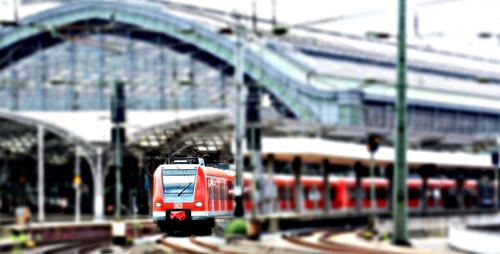
At train stations, AI-powered video analysis is used to turn existing cameras into tools for measuring passenger flow. It generates three categories of metrics: real-time passenger density by zone, travel times between two points within the building, and passenger throughput at bottlenecks, such as stairways, transfer corridors, turnstiles, and platform access points. These metrics enable action to be taken before congestion occurs, rather than simply reacting to it once it has.
The difference from traditional counting lies in the spatial resolution. A station does not become saturated uniformly; it becomes saturated at a specific location and at a specific time, often because two passenger flows intersect. Knowing that a connecting corridor is approaching its critical threshold twelve minutes before the next train arrives has greater operational value than the daily total number of passengers. XXII, a French computer vision software provider, generates these indicators using its CORE platform, without facial recognition.
Why congestion at stations always occurs in the same places
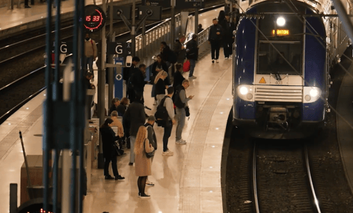
A station does not receive a continuous flow of passengers. Passengers arrive in waves timed to train schedules. Between arrivals, the spaces are empty; when a train pulls in, several hundred people simultaneously head toward the same exits.
Bottlenecks are therefore largely predictable: escalators and stairs leading to a platform, transfer corridors between two lines, ticket validation areas, the main exit, and the areas around information screens. What changes from one day to the next is the intensity and simultaneity. Two trains arriving three minutes apart instead of eight create a situation that bears no resemblance to the average.
It is this variability that continuous measurement allows us to capture. An hourly average smooths out precisely the phenomenon we need to observe.
Which indicators to track to manage passenger flows
Density by Zone
The number of people present in a defined space, relative to its surface area, provides a direct indication of comfort and risk. Thresholds defined by zone, in consultation with operations and security, allow an alert to be triggered as the limit is approached rather than only after it has been exceeded.
Throughput at access points
The number of people crossing a virtual line per minute measures the actual capacity utilization of a staircase or hallway. Compared to its theoretical capacity, it reveals bottlenecks that do not appear on floor plans.
Travel time between two points
The average time it takes to reach a platform from the concourse is the most telling indicator of transfer efficiency. It is measured without tracking any specific individual, through a statistical comparison of incoming and outgoing passenger flows in an area.
Average travel speed
A general slowdown in a corridor clearly precedes a stoppage. This indicator often provides the earliest warning, even before density reaches its threshold.
How these measures improve transfers
A transfer is the moment when a station generates the most value and the greatest risk. Three key factors come into play.
The first concerns the distribution of passengers among several equivalent routes. A station often offers two or three routes to reach the same platform. When measurements show that one corridor is becoming congested while another remains clear, passenger information systems can redirect part of the passenger flow toward the available route, either via digital displays or audio announcements.
The second concerns the calibration of announced connection times. The displayed times are generally based on a theoretical walking time. Actual measurements, taken by time slot, reveal the discrepancy between this theoretical value and real-world crowd conditions, allowing for the adjustment of connections deemed too tight at certain times.
The third involves preparing for service disruptions. When a train is canceled, its passengers are rerouted to the next one. Knowing the current passenger density in waiting areas at the moment the decision is made changes how the information is communicated and how staff are deployed.
How Passenger Information Relies on This Data
Traditional passenger information provides schedules. Flow data allows it to also provide useful instructions at the exact moment they are needed.
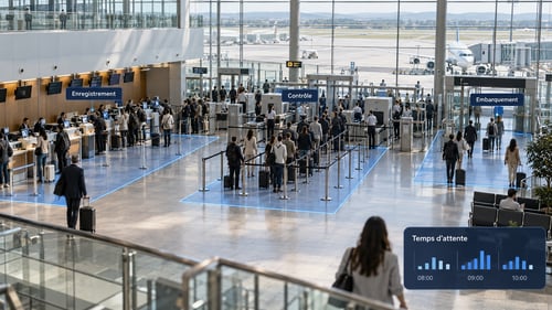
Three types of messages work well at stations: directing passengers toward a less crowded entrance, phrased simply and displayed before the decision point—that is, before the relevant platform—and indicating the distribution of passengers along the platform, which limits crowding in front of the first cars. Finally, announcing the actual wait time at a checkpoint or ticket window, which reduces frustration more than the wait time itself.
The key to success is the same in all three cases: the message must precede the decision point. A sign posted in a corridor that is already crowded arrives too late.
How to Manage Staffing and Operations
Indicators are only meaningful when related to a decision. At the station, four decisions come up regularly.
Positioning reception and security staff in the specific areas where crowd density actually rises, rather than assigning them to fixed locations. Opening or closing ticket validation lanes based on observed passenger flow. Adjusting maintenance schedules to prevent cleaning from reducing the usable width of a corridor during a passenger surge. Finally, making decisions regarding facility improvements when data indicates that a bottleneck is structural rather than temporary.
Within a network of stations, comparing similar sites is the key benefit. A station where transfer times deteriorate significantly faster than at stations with a similar layout indicates an identifiable problem: signage, the width of an access point, or the location of a piece of equipment.
What are the technical and legal requirements?
On the technical side, three conditions determine feasibility. Camera framing must allow for the identification of individuals within the relevant area, which often rules out cameras mounted very high for the purpose of resolving doubts. Access to the video streams must be possible via the local network or the recorder. The site’s connection must support the chosen processing method, bearing in mind that on-site analysis significantly limits bandwidth since only the processed data is transmitted back.
From a legal standpoint, the GDPR applies whenever processing involves personal data, and the image of an identifiable person falls under this category. A solution that counts silhouettes and measures durations, without resorting to facial recognition, avoids the biometric data regime set forth in Article 9 of the GDPR. The standard obligations remain: informing individuals through posted notices, a defined and non-misappropriated purpose, limited retention periods, and an impact assessment when the processing warrants it. The CNIL has published a position paper on so-called “augmented” cameras that helps define the intended use. When employees are involved, consultation with employee representative bodies is required under the conditions set forth in the Labor Code.
Where to Start
Choose a specific area and a specific decision to address, not a comprehensive program. A transfer corridor known to become congested, a platform staircase, or a ticket validation area are sufficient to generate an initial framework for analysis. Collect data over several weeks to account for weekly variations and atypical days, then compare the data with what field teams observe: the discrepancies between the two often yield the most valuable insights.
XXII’s CORE platform was designed for this type of phased deployment across an existing camera network, with local or centralized operation depending on site constraints.